 Written by
 Exploring the Differences between Mobile
and Responsive eLearning
In 1995, when Brookwood first started to develop eLearning web delivery was not an option, and eLearning was more commonly known as Computer Based Training (CBT). CBTs were typically delivered on a CD-ROM and played locally on the learners’ computer.
As early as the late 1980’s guidelines were put in place to ensure consistency for content developed across multiple vendors. Since this is not a history lesson on AICC, SCORM or Tin Can, I will not go into further details on these guidelines. The point is that eLearning has evolved along with technology, causing some confusion along the way. One particular aspect that could use a bit more clarity is the difference between mobile design versus responsive design for your eLearning content.
Let’s start with mobile design simply because the concept of mobile design predates responsive design. With the advent of smartphones, the training world was clamoring at the possibilities of delivering “just in time training” on a device so frequently used that it does not require 5 minutes to boot up (that means turn on) and small enough to carry anywhere. These mobile devices [mainly cell phones, followed by tablets] were connected to the internet, making it an efficient place to deliver content…and mobile learning, commonly known as mLearning was born.
Mobile learning essentially is the ability to use a mobile device to consume learning content. Whether you are on a train, plane, beach, or lake, easy access to your mobile device allows you to take a course on your own time without the constraint of sitting at your desk. Great, right? Just one caveat- it required the content produced by eLearning developers to be redeveloped to fit in the screen size of a phone or tablet. Imagine taking an eLearning course that was developed for a PC or notebook and proportionately squeezing it into the space of a phone or smaller tablet. Text and buttons would be too small, making for a poor learning experience. And so, to effectively deliver mLearning content on a phone, developers would have to maintain multiple versions to fit the size of each mobile device. Not a very cost-effective endeavor.
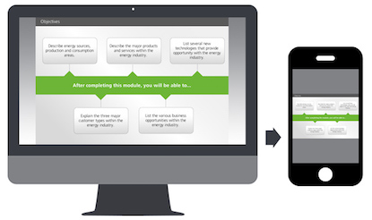
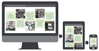
Responsive eLearning design (rLearning) is a technique that allows content developers to create a course that can be delivered on multiple devices by automatically adjusting the content to the optimal layout for the device. Rather than using a “shrink to fit” metaphor, the content dynamically reformats to best fit the screen size of the device. For example, content displayed on the PC screen may contain 4 images placed horizontally with text beneath the image. That same content being displayed on a smartphone, could display the images vertically, and when selected the text may appear as an overlay on top of the image. Responsive eLearning design can support multiple devices, offer content parity and is easier to maintain than mobile eLearning design.
In conclusion, it may not be fair to compare mLearning versus rLearning, as these techniques are really the continuous evolution of learning technology. The efforts of developing mobile eLearning content created the path for a more efficient way of delivering responsive eLearning content.